Structure and spreadsheets
"A well structured file is similar to a well structured story."
– “Cleaner, Smarter Spreadsheets Start with Structure”, by Sandhya Kambhampati, now of the Los Angeles Times, The Source. </blockquote>
Understanding data types
When you start working with structured data, there is an important unspoken rule: Each column should contain the same type of data, often broken into three categories: text, numbers and dates.
This video goes through the basic types of data that you’ll find within a table such as an Excel worksheet, and what opportunities and traps await you.
Test yourself
If you can’t answer these questions, review the video again.
- What happens if you try to add up cells that contain a mix of numbers and text?
- Why does 11/2/2019 come after 2/14/2019 when sorted, even though they are alphabetically in the other order?
-
Is this considered a number in Excel?
2,148,232*
Most programming languages enforce a single data type for each field or variable in a data frame or table. Instead of keeping the wrong version, it will turn all of them in to characters if it isn’t sure. It will turn all of the characters to missing data if there are only a few.
As you get into programming, there are much more complicated data types that are really powerful. For example, a data type of “data frame” is used in R and Python to act like an Excel sheet. A json object can define a whole database in nested text. Those types will be covered in later modules.
Tidy data
“Like families, tidy datasets are all alike but every messy dataset is messy in its own way..” – Hadley Wickham, with apologies to Leo Tolstoy
Hadley Wickham, who has done more to popularize the R programming language than almost anyone, wrote a seminal paper in 2014 called “Tidy Data”, which tackled the unspoken problem in data analysis: what does “clean” data mean, and what does “dirty” data mean?
In it, he defined tidy data in this way:
-
Every column is labeled and represents a variable, or something that differs from case to case. Examples include peoples’ names, counties, zip codes, height, age, income, or year.
-
Every row, which may or may not be labeled, represents an observation, or an instance of each of the variables. An example might be your name, the county and zip code you live in, your height, age, income, and what year it is today.
-
Each type of observational unit is in its own table, such as a page in an Excel file or a data frame in the R language. This suggests that every observation should be a the same unit of analysis. For example, there can be information about every student at your school in one table, and information about every department in your school in another.
Think of a row as the subject of a sentence, and the column as an object: “More schools (observations/rows) had low vaccination rates (variable/column) this year (variable/column) than last”.
In other words, each column means one thing, each row is an instance of that thing. It means you’d rarely type two separate things into one cell, such as two names or two addresses. It also means you’ll often have a tall, narrow dataset – one with a few columns but many rows – rather than the short and wide datasets you often see. This makes it easy to sort, filter, and group your data into other information.
It’s always easy to turn these tidy datasets into another form. It’s often difficult to turn messy datasets into something tidy.
Look through Wickham’s list of ways that day is often untidy (about halfway down the document). Don’t worry about the programming in R that he suggests to fix the problems. Concentrate instead on the different ways that untidy data frequently appears.
Tidy example
Here’s an example, showing the beginning of a file obtained from New York State showing the names, locations and salaries of judges in the state’s Supreme Court (the main trial court in New York):
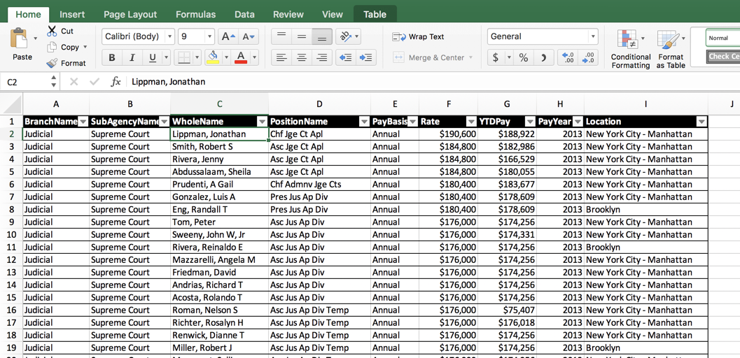
It follows the simple rule that every column always means one and only one thing, and every row is an instance of that thing at the same level of analysis – the employee.
It’s not perfect. The position titles don’t really show their level, but instead are sometimes used to show districts. In this sense, it’s not quite tidy: separating the title from the district would make it more useful.
Not so tidy
When you request data from the government, or seek out data on the Internet, you should look for tidy data. It is often the most pure form of the information available – it hasn’t been compiled into a report, or put together to make a nice printout. Instead, it is usually close to the way it’s been stored in the underlying database.
Think of this when you see forms in the wild. They are often pretty tidy! A parking ticket is one instance of a thing, and each box filled out or left blank on the ticket is a characteristic of that thing.
Sadly, the information and datasets you receive from others will often NOT adhere to tidy principles. Government “datasets” often have a lot of extra verbiage at the top and bottom, or are done in a hierarchical fashion, mixing detail and total at the same time. In this example, the Census Bureau seems to anticipate that you will print this data, not use it:
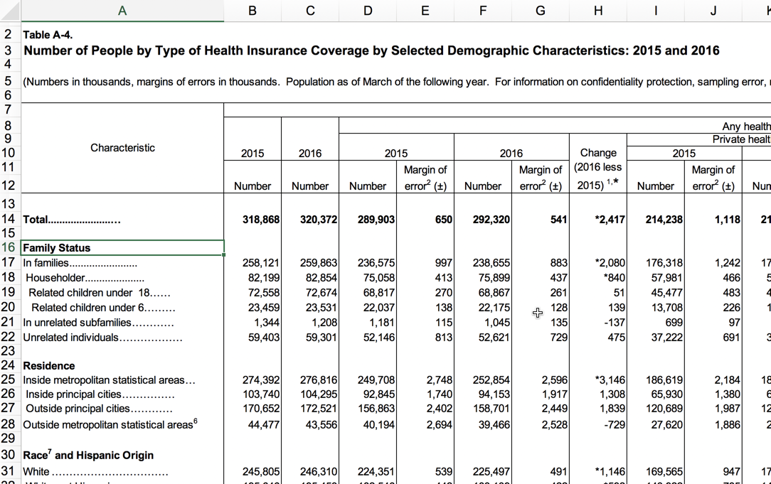
If you just needed a few numbers from the release, this table is perfectly adequate. But if you wanted to combine it with other data or sort it in any way, it’s nearly useless. When you come across data that looks like this – with subtotals and different topics broken down the side, and many figures going across the top – look for other formats that might have been released, or talk with the agency to get something more useful. In this case, we’d look for the underlying data that created these tables.
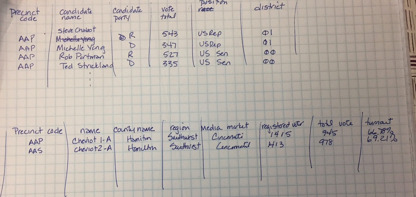
Here’s another example, this time from the Ohio Secretary of State, that lists the results of the 2016 election. Each page is one type of race – Congress, president, etc. – and each column shows the result for a candidate within a race. The rows are sometimes the precinct, and sometimes the total.
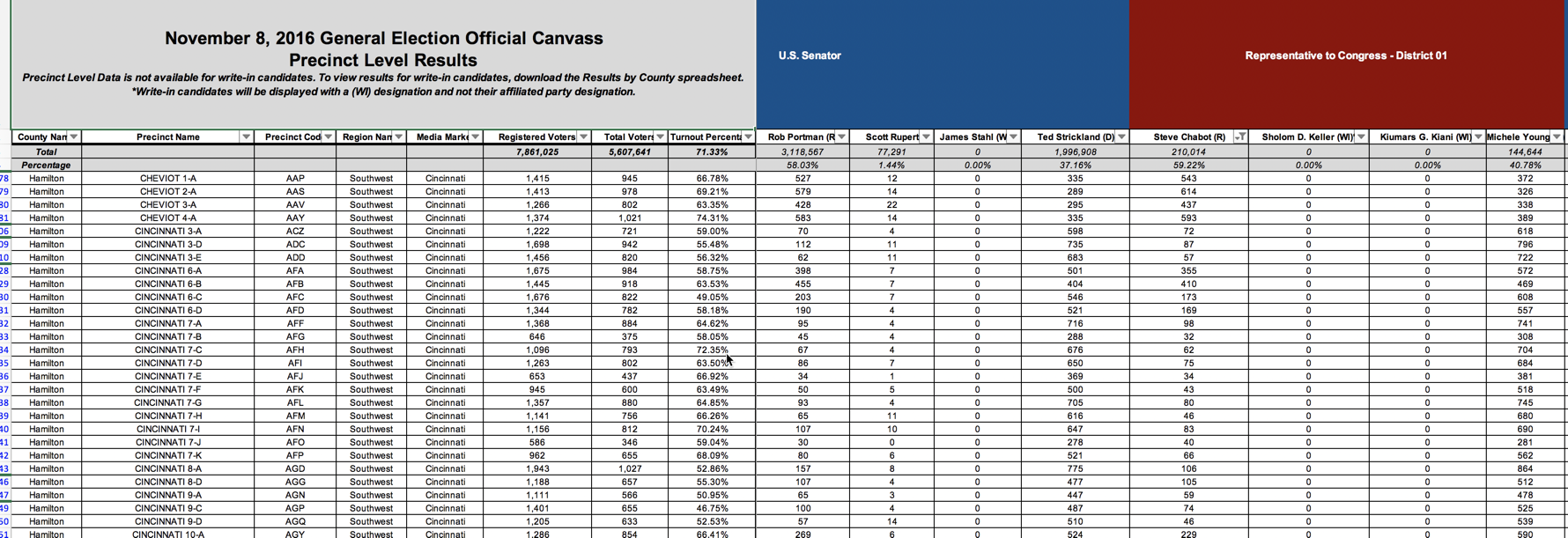
There are totals mixed in with the precincts, and each of the candidates are listed left to right for every Congressional race. This makes it easy to read if you want to see who won. But each precinct would only have one race for U.S. Senate and one for the House, meaning that most of the values listed in this very, very wide spreadsheet are zero.
Fixing untidy data, part 1
When you encounter untidy data like the example above, take out a piece of paper and sketch what a more tidy version of this spreadsheet might look like. What are the column headings, what does each row represent, and how might it be put together? It’s actually more complicated than it seems. Just remember that, so long as each table you create has a unique identifier that represents just one thing, you can always link them together.
(Computer scientists shouldn’t confuse this with the “3rd normal form”. This is much less rigid about breaking out tables whenever there is repetition, but it does adhere to the idea of a single unit of analysis in each table.)
This is an excellent exercise for you to do whenever you are working on data: envision success. If you had what you wanted, what might that look like?
Here is an example spreadsheet of a series of ways that governments have provided data when it was requested. Go through them and think about how they might be useful – what might they look like? How could you use them to sort and filter? How could you add or count them effectively?
Here’s a video that goes through what is wrong with them and how we fixed it.