Summarize with pivot tables
Grouping data for summaries
Summarizing a list of items in a spreadsheet is done using pivot tables. In other languages, it’s considered “aggregating” or “grouping and summarizing”.
Think of pivot tables and grouping as answering the questions, “How many?” and “How much?”. They are particularly powerful when your question also has the words “the most” or the “the least” or “of each”. Some examples:
- Which Zip Code had the most crimes?
- What month had the least total rainfall?
- How much did each candidate raise last quarter?
- In playing cards, how many of each suit do I have in my hand?
- On average, are Cronkite students taller or shorter than in other schools?
While filters give you a count of the number of items that match a specific question, such as “I want to see all of the homicides in my city”, pivot tables can show you whether your city has more homicides than others in the dataset.
These can be tricky, but if you master them, you’ll be able to answer most of the reporting questions that come up in a newsroom, and will have a new way to start your reporting with better questions.
Confusing grouping with sorting or arranging
Many reporters confuse this summarization with “sorting”. One reason is that this is how we express the concept in plain language: “I want to sort Skittles by color”.
But in data analysis, sorting and and grouping are very different things. Sorting involves arranging a table’s rows into some order based on the values in a column. In other languages, this is called arranging or ordering, much clearer concepts. Grouping, which is what pivot tables do, is a path to summarizing using count, sum, or average, for example by category. It means “make piles and compute statistics for each one.”
When to use filter vs. pivot tables
Sometimes, you can get the same information from a filter as from a pivot table, but they really are different animals.
A filter is used to display your selected items as a list. You’ll get to see all of the detail and every column. As a convenience, Excel shows you how many items are in that filtered list. That’s great when you want to just look at them, or get more information about them. For instance, if you had a list of crimes by ZIP code, you might just want to see the list in your neighborhood – where, exactly, were they? When did they happen? Was it at night or the morning? What crimes happened on which blocks?
A pivot table is used when you just want to see summary information – does my ZIP code have more crime than others? Are robberies more common than car theft in my Zip code, and how does that compare to others?
The other time filters will likely be useful is when you have long text fields that aren’t standardized into some kind of category. For example, a description of each crime would be unique, so there’s really nothing to summarize.
In practice, you’ll go back and forth between summary and detail. They’re both important, just different.
Tutorial
Data file
Once again, we’ll use the data file from the opioid EMS calls in Tempe to do some summarizing. This one is edited from the one we used in filtering to add some categories ripe for summarization. Look on the “diary” tab if you’re interested in how I created the “weekend” flag.
Setting up the pivot table
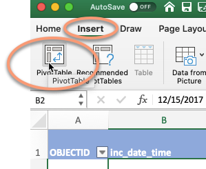
Start with your cursor somewhere in your data table, and choose Insert, then Pivot table
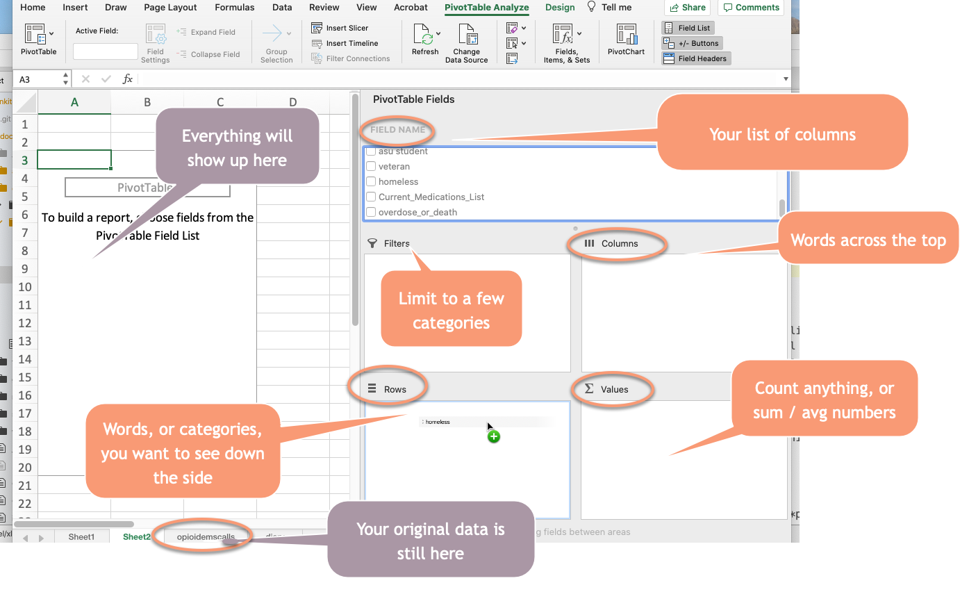
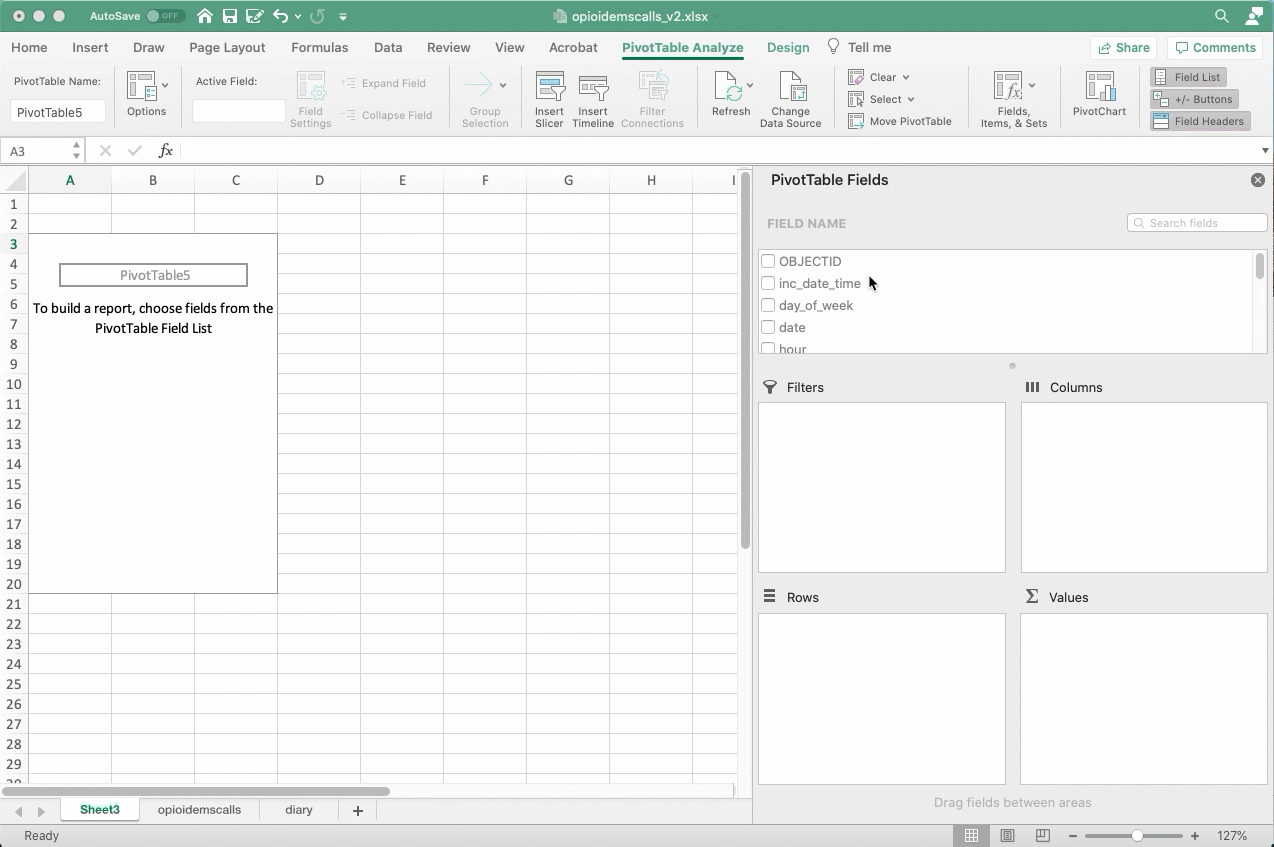
If all goes well, it will look like your data disappeared. It didn’t – you’re just on a new page. Here’s what it looks like:
Counting , or “how many”?
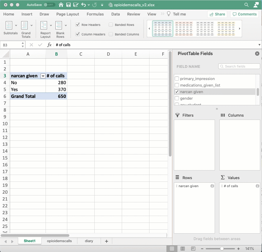
Most of the time, you’ll be working with questions of “how many?”. Reporters rarely deal with lists that have a lot of numbers in them – those are often financial lists, like bank records, or medical or testing records. Without any numbers to work with, we’ll almost always want to count. Here’s an example of how to count the number of opioid EMS calls that involved homeless people:
Here’s how you set it up to count the number of calls involving homeless people, hiding those that weren’t identified either way:
Keep your nouns in mind. This is a list of calls , not a list of people. We don’t know if each call is a different person. That’s why I change the headings - to remind myself of what noun I’m working with.
Try working with some other variables – how many involving ASU students? How many on weekends? And how many were given Narcan, the antidote to an opioid overdose. All you have to do is change the column name in the “Row” area, and you can count anything!
Adding complexity: Percents of totals
It’s hard to compare raw numbers unless they’re really small. Instead, we’d like to know what percent of all calls were of homeless people, and what percent of all calls involve homeless people. To do that, you’ll repeat the computation in the “Value” area, but change the way it’s displayed from the raw number to “Percent of column”:
Answering interesting questions
Most questions that we have around summaries aren’t as simple as “how many” or “how much”. Often we want to know a comparison between groups – a question of “more likely” or “less likely”. To do that, you need two columns to compare to one another, then you want to compare the percentages.
Try to think of some interesting questions on your own, but they often come down to disparate treatment. For instance, if you think that getting Narcan is something of a privilege – something you get because someone is trying to save your life – you might wonder if homeless people get it as often as those who were not homeless. Here’s how you’d answer that question:
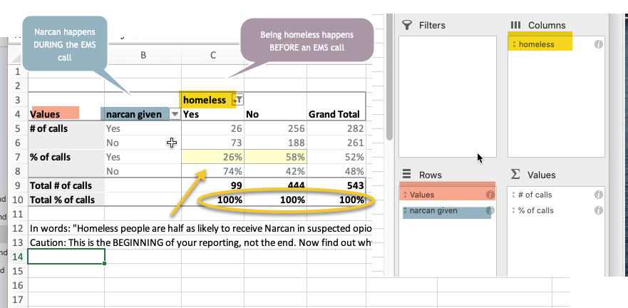
Technically, you’d read this to say, “About one quarter of the calls involving homeless people were given Narcan compared with more than half of the calls involving non-homeless people.” You could also say “Narcan was administered less than half as often on patients who were suspected to be homeless as those who were not.”
Once you compute this, you might want to control for some things that might not be the same across the populations. For example, Narcan only works on opioid overdoses. Try adding the “probable_opioid” column into the filter area and limit the analysis only to those that are quite clearly opioid calls.
It only works well in examples like this, where there are enough instances in every corner of the box that you care about. But it’s worth trying.
Of course, you can’t just go into publication with these results. This marks the beginning of your reporting, not the end. You’d want to talk with EMS workers, homeless advocates, experts in overdoses, and others to find out if there are good reasons for this pattern. You’d also want to probe to find out any reason it might be misleading – it might, in fact, be something caused by a third factor that isn’t in our dataset. Be on the lookout for all the reasons your initial results might be wrong, but this gives you a place to start asking questions – the key to good reporting.
The headings annoyance
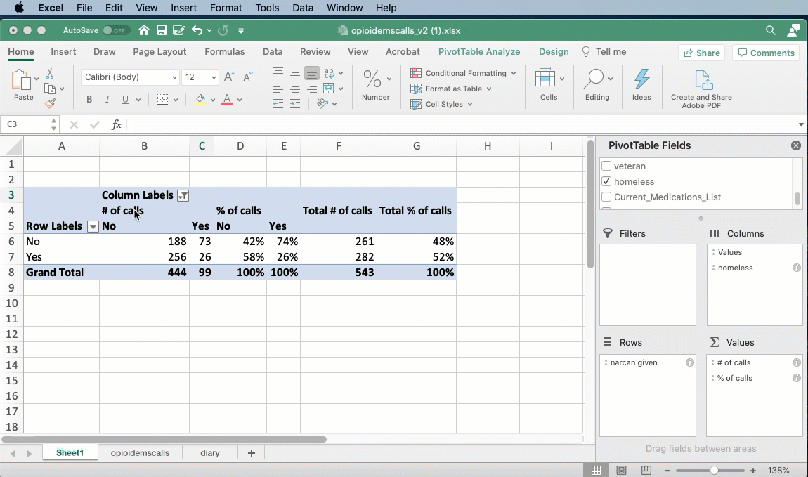
By default, Excel uses a format for pivot tables that hides the names of the columns and rows. You can fix this by changing the design of the table from “Compact” to “Tabular”:
Another walkthrough with baseball results
For a detailed walkthrough on a season of baseball scores, see the “Arizona Diamondback scores” tutorial under “Excel practice”.