Sorting and filtering to find stories
- A sorting miracle
- Sorting and filtering as a reporting tool
- Tutorial
- FAQ
- Video of sorting and filtering with salaries
A sorting miracle
After Ferguson, Mo., police killed Michael Brown in 2014, advocates and journalists began examining the racial and ethnic gap between police departments and the communities they served. The New York Times found a 7-year-old survey conducted by the Justice Department that allowed it to compare the data for major cities in a standalone graphic that it published later that year.
When newer data reflecting departments’ makeup in 2012 was released a year later, Matt Apuzzo and Sarah Cohen hoped it would show some differences. It didn’t. So they were left trying to find news in the data that was clearly of public interest.
After matching up the demographics of police departments with their cities, Cohen started sorting, filtering and Googling. Could there be news in the outliers on the list? Which departments most closely represented their communities? Which ones had unusually large gaps?
She quickly stumbled on telling anecdote to frame the story: Inkster, Mich. had one of the least representative departments in the country, and had recently hired a new police chief to help mend the department’s fraught relationship with its largely African-American community. Where had he come from? Selma, Ala., one of the most representative police departments in the nation. Interviews with the chief, William T. Riley III, suggested one reason for some cities’ disparities: there was no state or federal money to pay for training new police officers.
“There’s no doubt in my mind we have good police candidates in this city. No doubt,” said Chief Riley, who is African-American. “How hard can it be? You’re telling me everybody here can’t be a police officer?”
The story, “Police Chiefs, Looking to Diversity Forces, Face Structural Hurdles” helped explain the persistent gap between the makeup of police in some areas and the communities they served.
Police Chiefs, Looking to Diversify Forces, Face Structural Hurdles
INKSTER, Mich. - When William T. Riley III became the police chief of this small city west of Detroit this summer, he found a department that bore little resemblance to the city it served. Nearly three-fourths of Inkster's 25,000 residents are black. Its mayor and all six City Council members are, too.
Sorting and filtering as a reporting tool
Reporters frequently sort and filter for both stories and for data integrity and cleanup.
One of the most common uses of sorting and filtering comes with spreadsheets you build yourself. If you keep your data tidy and make sure that each column has the same type of information – particularly dates – it does’t matter if you’ve had to collect it piecemeal and out of order. Sorting can magically turn it into a chronology, useful for spotting holes in sources’ stories and putting background information in context. If you build fact-checking and sourcing into your spreadsheet, filtering can hide from you any material that isn’t publishable while you’re writing, making it less likely to let poorly sourced or secondary source information into your story.
Sorting and filtering can also:
- Show you rows containing the highest and lowest values of any column. That can be news or it can be errors or other problems with the data.
- Let you answer quick “how many?” questions, with a count of the rows that match your criteria. (In the next lesson, you’ll see that pivot tables, or group-by queries, are much more powerful for this in most cases.)
- Together, sorting and filtering can narrow your dataset to just the items you want to examine more closely in your reporting.
Tutorial
Data file used in this tutorial:
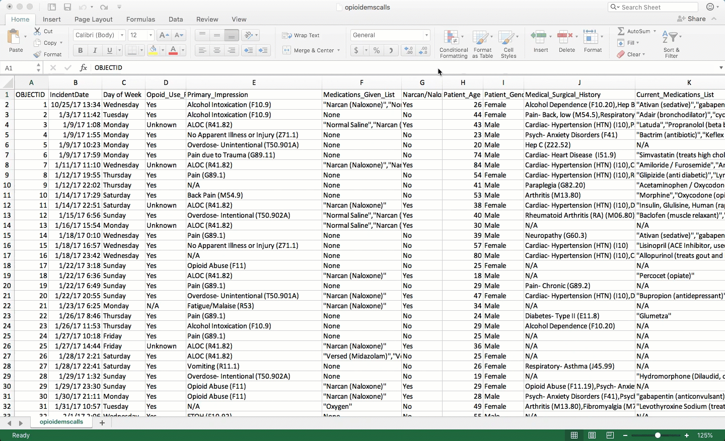
Opioid-related EMS calls in Tempe, Az. This dataset was downloaded from the Tempe Open Data site in 2018. Beginning in 2019, it stopped publishing some of the details in this example, but it still has the basic information on its open data portal. It contains a list of every 911 call that emergency workers thought were associated with opioid overdoses. It contains information on the date, time, demographics of the victim, what was wrong and what they were treated with in the ambulance. Some repetitive columns were removed.
It’s a great spreadsheet for practice on dates and on text columns, but doesn’t really have any numbers to work with.
Data as tables
This dataset is set up as an Excel table, which has a few characteristics that are useful for analyzing database-like spreadhseets. They enforce a little structure and rigor onto a spreadsheet, which usually lets you do whatever you want. There are several benefits to data tables:
- Formulas automatically copy throughout your data, whether or not there are empty values next to them.
- Sorting and filtering are always done on the proper list of rows, once you’re made sure to define the table correctly.
- You can use column names rather than addresses to reference a field. (This can be good or bad.)
- The column names always stay at the top of your screen, making it unnecessary to freeze panes (which can make navigation more difficult)
It also looks better.
How to create a table from a spreadsheet
Our table is already formatted this way, but here’s how it’s done:
Select your entire table, using Shift-CTL-* or by selecting the corners. Be sure NOT to select-all using Cmd-A or Ctl-A. You’ll select all 1,048,576 rows! Once you’re sure you have it selected properly, choose “Format as Table” from the main toolbar, then choose your preferred look.
A data table trap
One trap of the data table is that usually, Excel assumes you want to use the name of the column to create a formula. This can get old fast, since it no longer adjusts the column name to reflect moving to the next one. To turn off this behavior, go into Excel’s preferences and choose “Tables and Filters”. Then turn off the option that says “Use table names in formulas”.
Sorting
Sorting means rearranging the rows of a data table into a different order. Some reporters take a conceptual shortcut and call this “sorting columns”. That thinking will only get you into trouble – it lets you forget that you want to keep all of the rows in tact while changing the order in which you see them. In fact, in other languages it’s called “order by” or “arrange” by one or more columns – a much clearer way to think of it.
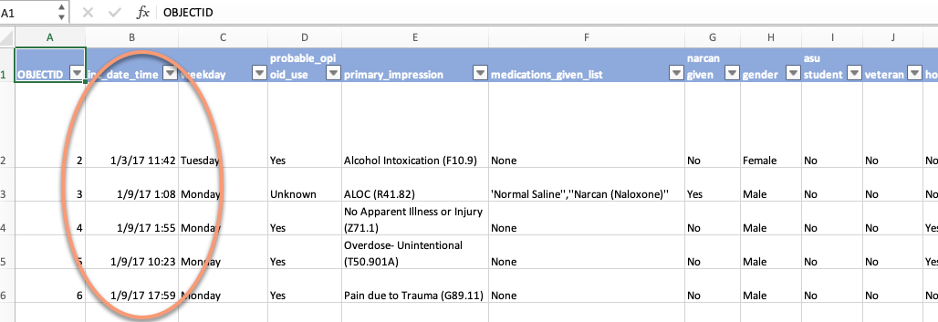
In Excel, look for the sort options under the Data tab at the top of your screen. In this case, sorting from oldest to newest gives you a list of the calls in chronological order, including the time of day.
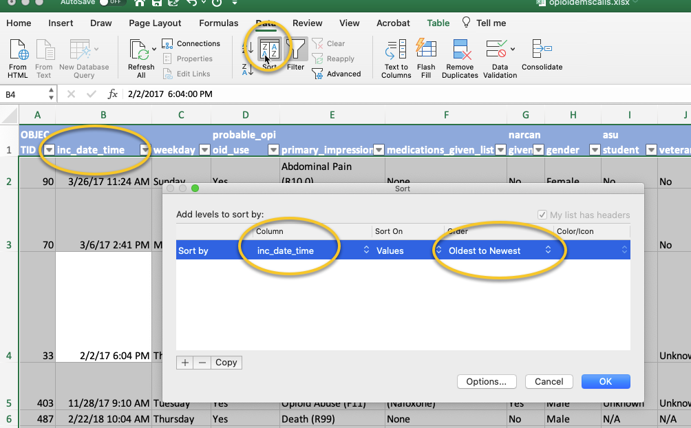
Gives you this:
Adding fields to the sort
You can sort by more than one column to see just the information you want at the top. When you add conditions, Excel sorts by the first column, putting the rows with lowest (or highest) values at the top. When those are the same, it will sort within that group by the second item you mention. And so on.
So let’s say I want to see all of the “probable” opioid-related emergency calls in Tempe that were treated with Narcan, ordered chronologically. We’re in luck, because “Yes” comes at the end of the alphabet, letting us sort “From Z to A” to get them on top.
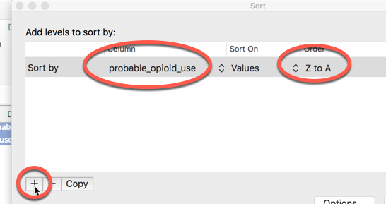
Add more levels using the + sign in the dialog box:
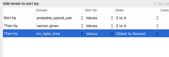
Notice that Excel understood that the first two fields were character fields, so it asks you if you want A->Z or Z->A (ascending or descending). But when it came to the incident date and time, it understood these were dates, so it asks if you want “Oldest to newest” instead.
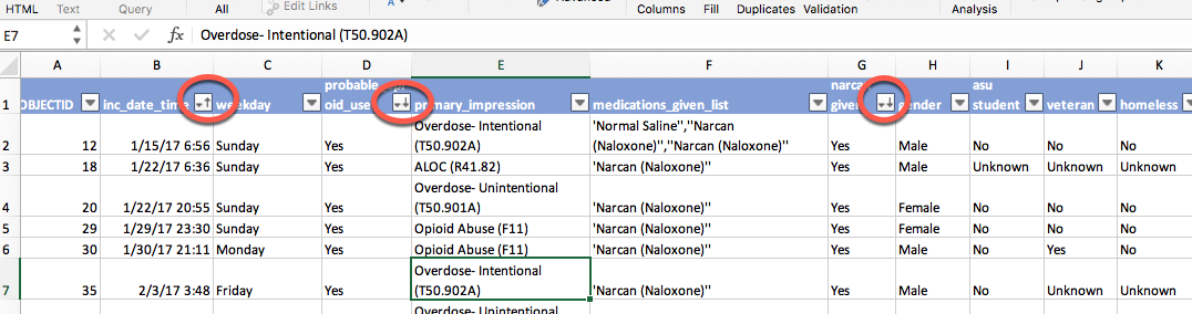
(The little arrows on the headers showing you they are sorted only happen when you have your data formatted as a table.)
Returning to the original order
When we went through best practices, one of the first steps was to add a column that included the original sort order as provided in the original data.
In this case, it’s the same as the incident date and time (inc_date), but you can’t count on that. Once you’ve sorted and re-saved your spreadsheet, there’s no going back.
Now you can see why it might be important to have that leftmost column of numbers to get you back to some natural order of the dataset.
Filtering
Filtering means picking out only some of the rows you want to see based on a criteria you select in a column. Think of it as casting a fishing net – the more filters you add, the fewer fish will be caught.
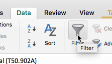
The filtering buttons are shown when you create a data table. If they’re not, look in your Data tab at top press the button that looks like a funnel:
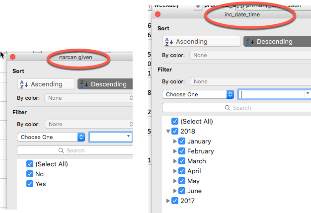
Looking through your filters is an easy way to see the range of information you have in your dataset. For example, pulling down the button for filtering on the Narcan flag, you see only the options for “Yes” and “No”. But if you click on the dropdown box for the incident date and time, you’ll first see just the years, which you can expand to months, days, and even hours.
Check and un-check any of the boxes that you want. Here’s a filter that picks out just the Narcan cases of probable overdoses, sorted chronologically. To get this:
- Sort the table by inc_date (meaning the incident date)
- Pick “Yes” from the narcan_given column,
- Pick “Yes” from the probable_opioid_use column
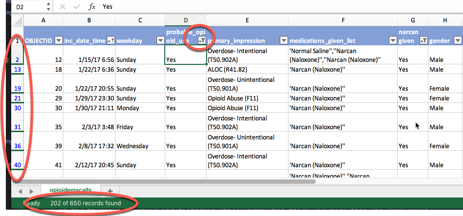
For a brief moment, Excel tells you how many of the rows match your filter – 202 of 650 in this case, shown at the very bottom of the screen.
(That count goes away as soon as you do anything else with the spreadsheet. You can just turn the filter off and on again to make it come back. We’ll see in pivot tables how to more effectively count some columns)
It also gives you several clues that you’re looking at filtered data: The row numbers have turned blue, and and there are dark lines between them when rows are skipped; the drop-down arrows now show a little funnel, indicating that you are using that column for a filter.
Removing filters
Don’t forget to remove filters before you start asking a new question. You can click twice on the little funnel at the top to clear everything, or click on the little red “x” next to “Clear”. This is an important habit to get into – you’d hate to think you’re looking at all of the narcan incidents when you already have a filter on ASU students as well!
Free text and date filters
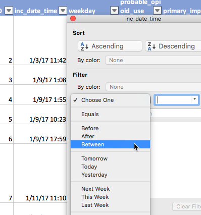
The filter box suggests that you can just type your search term to filter for words. It works – sometimes! On any large dataset, it will only filter the first 10,000 choices, which will give you wrong counts if you rely on the number at the bottom of the screen. For that reason, get into the habit of doing it the right way. Use the drop-down menu on the box to choose the word “Contains” (or “Begins with”) and type your words there:
And when you have numbers or dates, you’ll get different choices. We don’t really have any numbers on this dataset to work with, but here are some choices for dates:
Creating your own flags with filters
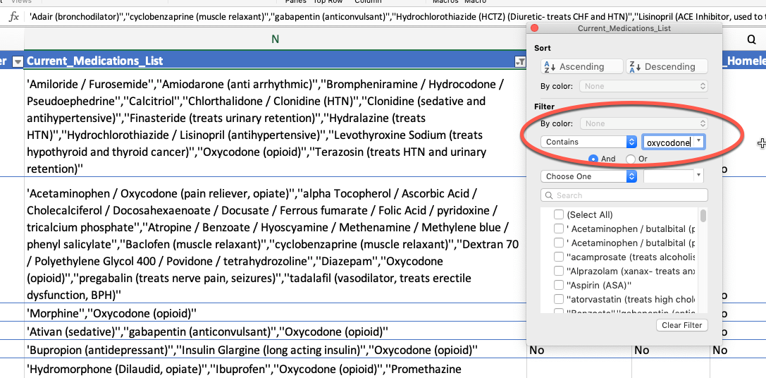
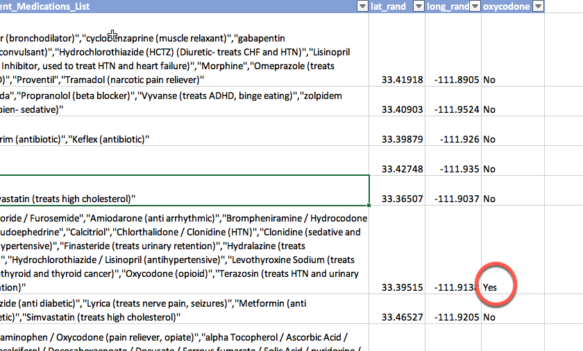
Just from this example, you see why analysts often create some seemingly repetitive information. In this table, there is a list of medications given by the EMS crew, and Narcan might be one of them. To make it easier to analyze, they have also added a “Yes/No” flag just for Narcan, which we used for sorting and filtering.
You can create your own flags using filters. (There are other ways to accomplish the same thing using formulas.) I wanted a simple “Yes” / “No” field for oxycodone. Going back to the text filter, we can see that there were 52 rows that contained a mention of Oxycodone in the “current medications” field. When I add a new header to the end, Excel automatically appends it to my data table. I can enter “Yes” into the first row, and copy down, and it will only fill in the visible cells. Remove your filter from the medications list, and it looks like this:
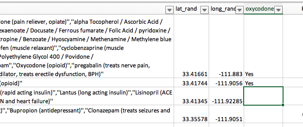
Now I can filter for all of the blanks in that field, and fill them in with “No” to create the rest of the flag:
Just be sure you document HOW you made your filter. What did you do with “(Blanks)” or anything that didn’t make sense? You should be able to recreate your flags exactly whenever you make them, and it’s easy to forget exactly what you did.
FAQ
How do I turn off all of my sort and filters
In the data tab, chose “Clear” (the funnel with the red “X”) to remove all of the filters and sorts on your table.
Where is the button to filter columns?
Sometimes you don’t want to see all of your columns – there are too many and they’re getting confusing. There is no column filter in Excel. (You’ll see how to filter, or “Select”, columns from a dataset in standard programming languages later.)
Instead, you can hide the columns you don’t want to see. When columns and rows are hidden, they generally won’t copy to a new sheet.
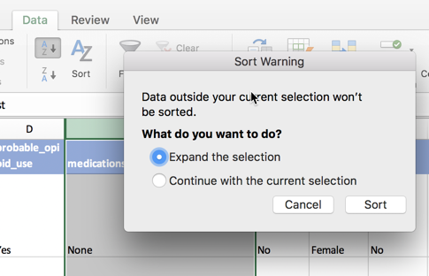
I’m getting weird questions and alerts about sorting
Slow down and read the alert. There are two common types of alerts in sorting, since it has the potential to wreck your spreadsheet.
The first comes if you selected an entire column, and then just hit the button that says “A-Z” with the arrow. Excel won’t let you do that if it’s formatted as a table, but it will if it’s just a normal spreadsheet. This alert asks you if you REALLY want to sort only the column you’ve selected, separating its meaning from the rest of the rows. The answer is NO. Always. Expand the selection as Excel wants you do to by default.
The other comes when you have numbers that are treated as text. This is a tricky question, and a properly tidied spreadsheet should avoid it most of the time. If you have the same type of data in each column, the answer to this question shouldn’t matter. If not, neither one will give you what you want.
I can’t copy formulas from left to right properly
This is because Excel is using the name of a column, not its cell position, to create tables. Go into your Excel preferences, choose Tables & Filters, then turn off the option that says “Use table names in formulas”.
I want to get rid of my data table
You can revert to the a plain old spreadsheet by selecting any cell within your table, then looking for the “Table” tab at the top of your screen. Choose the option that says “Convert to Range”.
Video of sorting and filtering with salaries
This video goes through many of the details of sorting and filtering. Follow along using this spreadsheet of Phoenix city salaries. It’s from a different year, but the idea is just the same.
Note that in this case, the original order of the dataset was alphabetical, except lower-case names came at the very end. It would be very hard to get back to this order in a spreadsheet if you didn’t have that leftmost column of numbers that indicated the original order.