How much fun is k-pop?
In 2018, Lisa Travis, a student at the Walter Cronkite School, wanted to know more about her musical passion: k-pop. We worked to get the 11 characteristics of top k-pop stars’ biggest hits into a dataset using the Spotify API. Now we can use her data to think about how numbers are useful in operationalizing concepts like “boring”, “fast”, or “sad”.
Anyone with a Spotify account can get access to its API, or Application Programming Interface. We used several R programs to put the data together – one pass got the most popular artists in Spotify by genre; the next found their top tracks; and the last rounded up the details about those tracks. Most of the metrics run from zero to 1. For example, a valence of 1 means the song is really, really happy. A valence of 0 means it’s really, really sad.
Read this analysis of one person’s playlist to learn more about what the different measures are, and how he decided to check if his music was boring. We’re going to go through some of the same measures and statistics to see how k-pop does in a similar analysis. (We’ll skip the machine learning prediction of whether a song is his or hers.)
- Data and documentation
- Import and interview
- Calculate some summary statistics
- Operationalize some concepts by creating new fields
- On your own
Data and documentation
kpop_spotify_tracks.tsv is a tab-separated text file exported from R containing the k-pop tracks. (There were some duplicates in the original dataset – I’m not sure how they got there, but they’ve been eliminated.)
Most elements are defined on the Spotify API track details documentation. The tracks were selected from those that can be played by subscribers in the U.S.
Additional fields came from other parts of the Spotify API. They are:
| field | description |
|---|---|
| artist_id | Spotify’s artist identifier, used to look up tracks |
| all_genres | Every genre that is associated with the artist, in a semicolon-delimited list |
| popularity | A value between 0 and 100, assigned by Spotify, with 100 being the most popular |
| follower_count | The number of Spotify followers for the artist |
| track_id | Spotify’s track id. The original scrape of the data resulted in some duplicates, often because they were available in several different versions. The most popular version was kept. |
| track_name | |
| track_popularity | A value between 0 and 100. When a track was listed more than once, the most popular version was kept. Spotify says it’s based on an algorithm that takes into account the number of plays and how recent those were. These values are aggregated to come up with artist popularity. |
| track_length | in milliseconds |
Import and interview
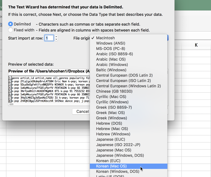
By using a .tsv file instead of a .csv file, you have more options when you open the dataset. Don’t double-click on it. Instead, start up Excel and use File / Open to open it up. That will bring you a diaolog box that asks how you want to deal with it. One of the options is to tell Excel what character set to use. Choose Korean (Mac). If you leave it at the default, all of the Korean characters will turn into mathematical symbols!
Take a few minutes to interview your data. Some possible first steps:
-
Convert the data to a table, and format some of the numbers to make them easier to read. (You’ll notice some of the numers are showing up in scientific notation, like -5.35E-06. Scientific notation is used for very, very large and very, very small numbers. This means that the number is 5.35*10-6, or 0.00000535.1
-
Insert a column and add an ID so you can get back to the original order.
-
Play with your filters while studying the documentation of what each column means.
-
What data type is each column? For example, “key” is actually something we would normally treat as words, or categories. “Mode” is a yes-or-no field. Many of the measures run from 0 to 1, with 1 being 100% of the characteristic, and 0 being none of it.
-
Get a sense of how much each value varies – are they all around the same level, or is there some range to the values? If a measure doesn’t vary enough, it won’t be interesting – there’s no news.
-
Try sorting by various fields. Are the most danceable songs also the happiest with high valence?
Turn off “named” formulas
Excel usually uses the column names in tables when you create formulas, which causes problems when you want to copy left-to-right. Turn off that option under Excel Preferences:
Calculate some summary statistics
It’s useful to know how much fields vary within themselves. You can calculate various statistics to get a good sense of this:
| Measure | Excel formula | Meaning |
|---|---|---|
| Mean | =AVERAGE(range) | the simple average of a column of values |
| Mode | =MODE(range) | the most common value |
| Standard Deviation | =STDEV.P(range) | A standard measure of variance. Rule of thumb: If it’s larger than the mean, the numbers are vey spread out. If it’s very small, there is almost no spread. This is a useful shorthand to see how well an average summarizes a group of numbers. |
| Maximum | =MAX(range) | the highest value |
| 75th percentile | =PERCENTILE.INC(range, .75) | three quarters of the values are at or below this level |
| Median | =MEDIAN(range) | the middle value, where half are higher and half are lower, or the 50th percentile |
| 25th percentile | =PERCENTILE.INC(range, .25) | one quarter of the values are at or below this level |
| Minimum | =MIN(range) | the lowest value |
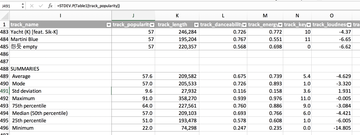
These are typical “descriptive statistics” that help you quickly sum up a set of numbers. Let’s take the track popularity field. The mean popularity score is 57, which is more that the average across all songs in Spotify. That makes sense because we chose the most popular kpop artists. The standard deviation is 9.6 (rounded to 10), meaning that two-thirds of the songs are between about 47 and 67 on the popularity scale. That’s not very much variation, but it’s enough to get something interesting out of it. The most popular track scored a 91, and the least popular scored 22.
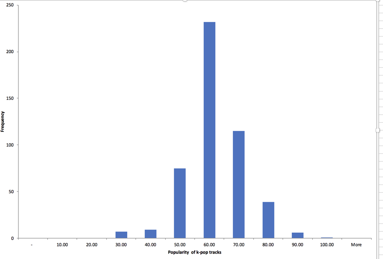
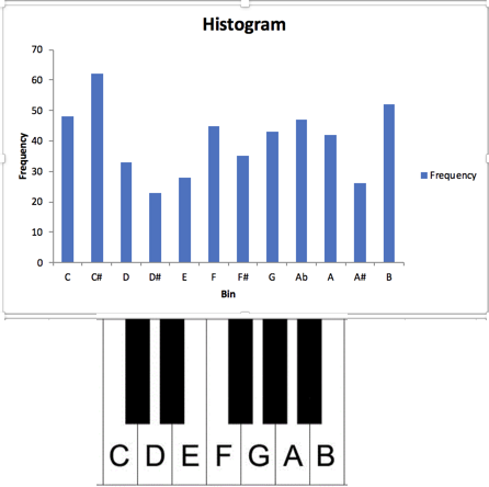
Here are two histograms, which show the number of songs that fall between the values shown on the bottom. The first one, of popularity, range from 0 to 100, and our songs are on the high end but have a fairly typical distribution. But the key, measuring pitch, has no pattern – there are just about an equal number of songs in each key. This tells you that there is no typical answer to key – an average doesn’t mean anything.
Popularity
Key
Operationalize some concepts by creating new fields
One research concept that you can use in journalism is the idea of operationalization. It’s a way of measuring something that seems immeasurable. In our example blog, the author operationalized the concept of “boring” by combining several variables: energy, danceability, tempo and loudness. However, these measures are on a different scale, so he had to bring them back to the same level by converting a few of them. The lower the measure, the more boring the song is. To make that easier to remember, let’s call it “fun-ness”
fun-ness = (loudness + 60) + tempo + (energy * 100) + (danceability * 100)
(Spotify has changed how it measures loudness since this blog was written. It now ranges from -60 to 0, so I added 60 to the measure so it would go from 0 to 60)
Doing this, our most “fun” song is HANGSANG, from j-hope. Our most “boring” song is TAEYON’s “All with you”
(I think the boring measure worked pretty well. I’m not so sure about the fun one!)
On your own
Think of a feeling you’d like to measure listening to the songs – then try to think of what variables, put together, might help you operationalize it.
Footnotes
- Scientific notation can actually cause you problems in computers. That’s because it’s an efficient way to hold numbers, but it also loses precision. In fact, in some languages, 0 doesn’t equal 0 because of it! It’s just something to be aware of when you get odd results.