Instructions
This spreadsheet contains figures for the estimated population of Arizona counties from 2013 through 2018. It also contains the components of change.
Your job is to find a story in this data by using change, percent change, percent of total to find something newsworthy.
As you do your analysis, consider what the various components might tell you. Did a county grow because of migration from other areas, or because there was a relatively high birth rates? Is the county dying off?
First steps
Make sure to read the documentation and any definitions you can find before you start. Consider the following steps:
- Start a document or page on the spreadsheet for your data diary
- Read the documentation available at the bottom of this page.
- If you don’t know where to start, try looking for some other stories about population changes, either in Arizona or elsewhere. They should give you ideas about what kinds of trends you might find. If you can find when the Census released the most recent estimates, you might find stories around that date from around the country.
- Open the file and do your usual checking: Look at the corners of the data, insert an ID number, and make sure you understand what every column means.
- Make sure you understand the nouns you have to use when you describe the data. What is the unit of analysis, or the level of detail? What do the numbers measure?
- Should columns be added together to form a total? Are there subtotals shown?
Ask some questions
See if you can find some questions to ask on your own of this data. Is there something that might be interesting to look into? Remember that we’re often interested in:
- Unexpected highs and lows (of change, or of some other characteristic)
- Individual values that buck a trend seen in the rest (outliers)
- Myths or myth-busting.
- Signs of distress or happiness.
- Newly discovered long-term trends
Data trap - negative numbers
It’s very hard to do percents of whole when there is a mix of positive and negative numbers. In the Fortune 500, for example, they don’t even try to compare one year’s loss with another year’s profit. The easiest thing to do is write around it – by that, I mean focus on the thing that shrank while mentioning it offset other gains.
Write a lede for a day story
Try writing a lede paragraph for a story. Normally, you would interview people or go to a place and observe before you wrote, but you should be able to craft a short, declarative sentence or paragraph that conveys the key finding you want to write about.
Although you don’t have an opportunity to fact-check this lede, do NOT make anything up or assume anything to fill in holes. Stick to what you can elicit just from the data.
Data Documentation
Source
The dataset was derived from the U.S. Census Bureau’s annual estimates of population of the U.S., which breaks down the change in population based on its components: Natural population change, which is births - deaths; migration, which includes net increases in immigrants from other countries (international) and other counties (domestic); and what it calls a “residual”, which is an unexplained portion of the estimated change in population.
The data was downloaded from the Census’s county population site at https://www.census.gov/data/tables/time-series/demo/popest/2010s-counties-total.html. The csv file is at the bottom of that page under “Datasets”.
The Census bureau uses many sources to compile these estimates, but they are not the same as a national census. The sources include vital records from state and local health department on birth and death certificates; estimates of domestic migration from tax and other records, and estimates of immigration from other countries from a variety of sources, including schools. They then try to make it all add up to the annual American Community Survey estimates at the state level.
The full methodology is linked off of the main page.
Changes to the file
-
Arizona counties and the state total were pulled out of the national file.
-
The data was kept for the years 2013 to 2018 to get a five-year change estimate.
-
Populations are kept for all of the years.
-
Net change in population, births, deaths, international migration, domestic migration, and residuals are the totals for the years 2013 through 2018.
-
The data was checked to makes sure that:
   births - deaths  = natural change
   international + domestic migration = net migration
   natural change + net migration + residual = population change
   population 2013 + population change = population 2018
“Residuals” refers to change that they think happened, but can’t figure out where it came from. (This is modeled based on a lot of factors, but in the end it has to add up to the U.S. population. That means that there are errors along the way. Residuals are a way to document that. Small counties have relatively high residuals, meaning they are less sure that the population is really what they’ve estimated. They won’t know until the Census is done in 2020.)
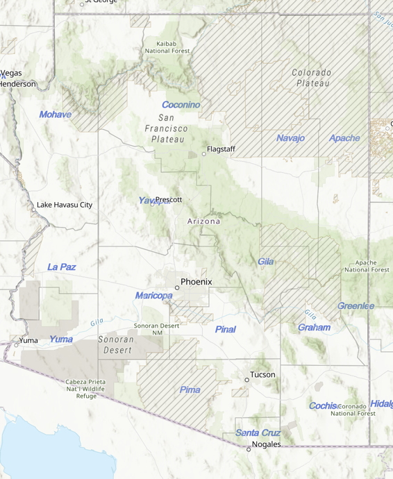
Reference map
It will be easier to work with the data if you have a sense of Arizona geography, especially which counties contain the large cities and which counties are made up of tribal lands. Green areas are national forest and parkland; striped areas are reservations.