```{r}
#| label: setup

library(tidyverse)
library(tigris)
library(sf)
library(tmap)
library(gt)

options(tigris_class="sf",
        tigris_use_cache = TRUE)
```33 The first map
In this chapter
- Create a map based on XY coordinates in a simple data file
- Get a base map from the Census using the
tigrislibrary - Join the map to Census demographics
- Combine the two maps in an interactive plot
Before you start, you will have to install a few new packages, either in the Console or using the “Packages” tab in the lower right of RStudio. These are:
tigrisfor getting Census base mapssffor working with simple featurestmapfor displaying the mapstmaptoolsto allow for an underlying reference map
This tutorial is based on one created by Aaron Kessler, senior data reporter at the Associated Press, for the 2022 NICAR hands-on workshop on visualization. His materials for that session are on his github repo
33.1 Using tmap vs. ggplot and leaflet
There are several approaches to getting maps in R. In general, the heavy lifting is done the same way – through the sf (simple features) library. But displaying the maps can be done many different ways.
The tmap library does a little more automatically than using the visualization library ggplot to make maps, so that’s the approach this tutorial will take. Neither is better - tmap is a little easier and requires a little less typing, but is not quite as easy to marry with other Javascript interactive maps or to customize using ggplot.
33.2 Setup
You’ll want to change your typical setup chunk to this when you start using maps:
The options make it easier to work with the Census bureau’s maps.
33.3 The first project
Our first project involves getting points on a map of Maricopa County, then displaying it based on Census demographics. Here, we’ll use voting locations as the points and Census tract level data for income.
Points
We have a list of voting locations that were geocoded by the Arizona Republic last year, courtesy of Caitlin McGlade. The locations aren’t exact – some of the digits were chopped off, and some weren’t found precisely. But they are generally in the right area.
Import that file using the usual read_csv() method.
locations <- read_csv("https://cronkitedata.s3.amazonaws.com/rdata/maricopa_voting_places.csv")

glimpse(locations)
Rows: 223
Columns: 7
$ site_name <chr> "ASU DOWNTOWN CAMPUS", "ASU WEST CAMPUS", "AVONDALE CITY HAL…
$ address <chr> "522 N CENTRAL AVE", "4701 W THUNDERBIRD RD", "11465 W CIVIC…
$ city <chr> "PHOENIX", "GLENDALE", "AVONDALE", "BUCKEYE", "QUEEN CREEK",…
$ state <chr> "AZ", "AZ", "AZ", "AZ", "AZ", "AZ", "AZ", "AZ", "AZ", "AZ", …
$ zip <dbl> 85004, 85306, 85323, 85326, 85142, 85335, 85255, 85234, 8525…
$ longitude <dbl> -112.0740, -112.1599, -112.3031, -112.5839, -111.6361, -112.…
$ latitude <dbl> 33.45377, 33.60733, 33.44517, 33.37083, 33.25029, 33.57322, …The Republic used a geocoding service that provides the data in the geographic reference WGS84, which is code 4326. There are names, addresses, and coordinates in this dataset.
Here is how to turn the simple data into a geographic dataset:
locations_map <-
    locations |>
    st_as_sf (
               coords = c("longitude", "latitude"),
               crs = 4326)
Now take a look at its structure, using the “str” rather than “glimpse” command, which provides a little more detail:
str(locations_map)sf [223 × 6] (S3: sf/tbl_df/tbl/data.frame)
$ site_name: chr [1:223] "ASU DOWNTOWN CAMPUS" "ASU WEST CAMPUS" "AVONDALE CITY HALL" "BUCKEYE CITY HALL" ...
$ address : chr [1:223] "522 N CENTRAL AVE" "4701 W THUNDERBIRD RD" "11465 W CIVIC CENTER DR 200" "530 E MONROE AVE" ...
$ city : chr [1:223] "PHOENIX" "GLENDALE" "AVONDALE" "BUCKEYE" ...
$ state : chr [1:223] "AZ" "AZ" "AZ" "AZ" ...
$ zip : num [1:223] 85004 85306 85323 85326 85142 ...
$ geometry :sfc_POINT of length 223; first list element: 'XY' num [1:2] -112.1 33.5
- attr(*, "sf_column")= chr "geometry"
- attr(*, "agr")= Factor w/ 3 levels "constant","aggregate",..: NA NA NA NA NA
..- attr(*, "names")= chr [1:5] "site_name" "address" "city" "state" ...This is hard to read, but take a careful look: Its type of data includes “sf”, along with data frame and table. The longitude and latitude columns are gone, replaced by a column called geometry.
We can check to see what projection R thinks it is in using the st_crs() function:
st_crs( locations_map)Coordinate Reference System:
User input: EPSG:4326
wkt:
GEOGCRS["WGS 84",
ENSEMBLE["World Geodetic System 1984 ensemble",
MEMBER["World Geodetic System 1984 (Transit)"],
MEMBER["World Geodetic System 1984 (G730)"],
MEMBER["World Geodetic System 1984 (G873)"],
MEMBER["World Geodetic System 1984 (G1150)"],
MEMBER["World Geodetic System 1984 (G1674)"],
MEMBER["World Geodetic System 1984 (G1762)"],
MEMBER["World Geodetic System 1984 (G2139)"],
ELLIPSOID["WGS 84",6378137,298.257223563,
LENGTHUNIT["metre",1]],
ENSEMBLEACCURACY[2.0]],
PRIMEM["Greenwich",0,
ANGLEUNIT["degree",0.0174532925199433]],
CS[ellipsoidal,2],
AXIS["geodetic latitude (Lat)",north,
ORDER[1],
ANGLEUNIT["degree",0.0174532925199433]],
AXIS["geodetic longitude (Lon)",east,
ORDER[2],
ANGLEUNIT["degree",0.0174532925199433]],
USAGE[
SCOPE["Horizontal component of 3D system."],
AREA["World."],
BBOX[-90,-180,90,180]],
ID["EPSG",4326]]Using the tmap library to display the map
tm_shape ( locations_map) +
  tm_dots ( )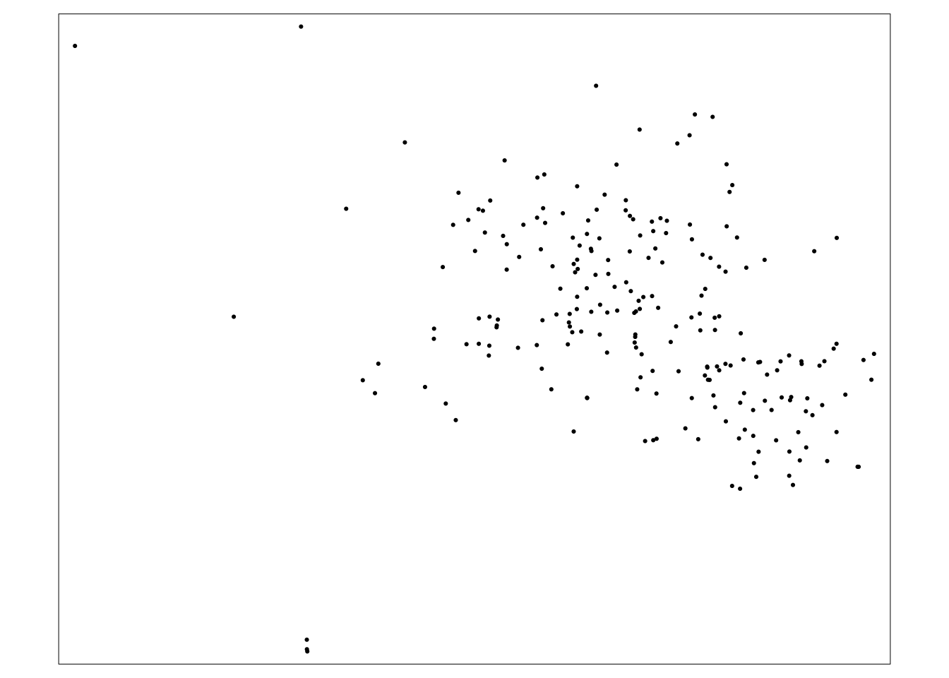
For a static map, there are a lot of extra packages that have to be installed and there are some dependencies that we don’t want to deal with. Instead, we’ll just view it as a dynamic map:
tmap_mode(mode="view")
tm_shape ( locations_map) +
  tm_dots ( )
# turn it back to plot
tmap_mode(mode="plot")Adding census tracts
The tigris package gets us access to all of the geographic data from the Census Bureau. Among them are Census tracts.
maricopa_geo <-
  tigris::tracts(state = "04", county="013", year="2020",
                 cb=TRUE)
Take a look at the projection that this file is in, since it ought to match when putting two maps together:
st_crs(maricopa_geo)Coordinate Reference System:
User input: NAD83
wkt:
GEOGCRS["NAD83",
DATUM["North American Datum 1983",
ELLIPSOID["GRS 1980",6378137,298.257222101,
LENGTHUNIT["metre",1]]],
PRIMEM["Greenwich",0,
ANGLEUNIT["degree",0.0174532925199433]],
CS[ellipsoidal,2],
AXIS["latitude",north,
ORDER[1],
ANGLEUNIT["degree",0.0174532925199433]],
AXIS["longitude",east,
ORDER[2],
ANGLEUNIT["degree",0.0174532925199433]],
ID["EPSG",4269]]This is a different coordinate system.
It’s ok, since we really want them both to be in a system designed for this part of the world.
We will present our map in the Arizona State Plane projection, 2868:
tm_shape ( maricopa_geo, projection=2868) +
  tm_polygons () +
tm_shape ( locations_map, projection = 2868) +
  tm_dots ( )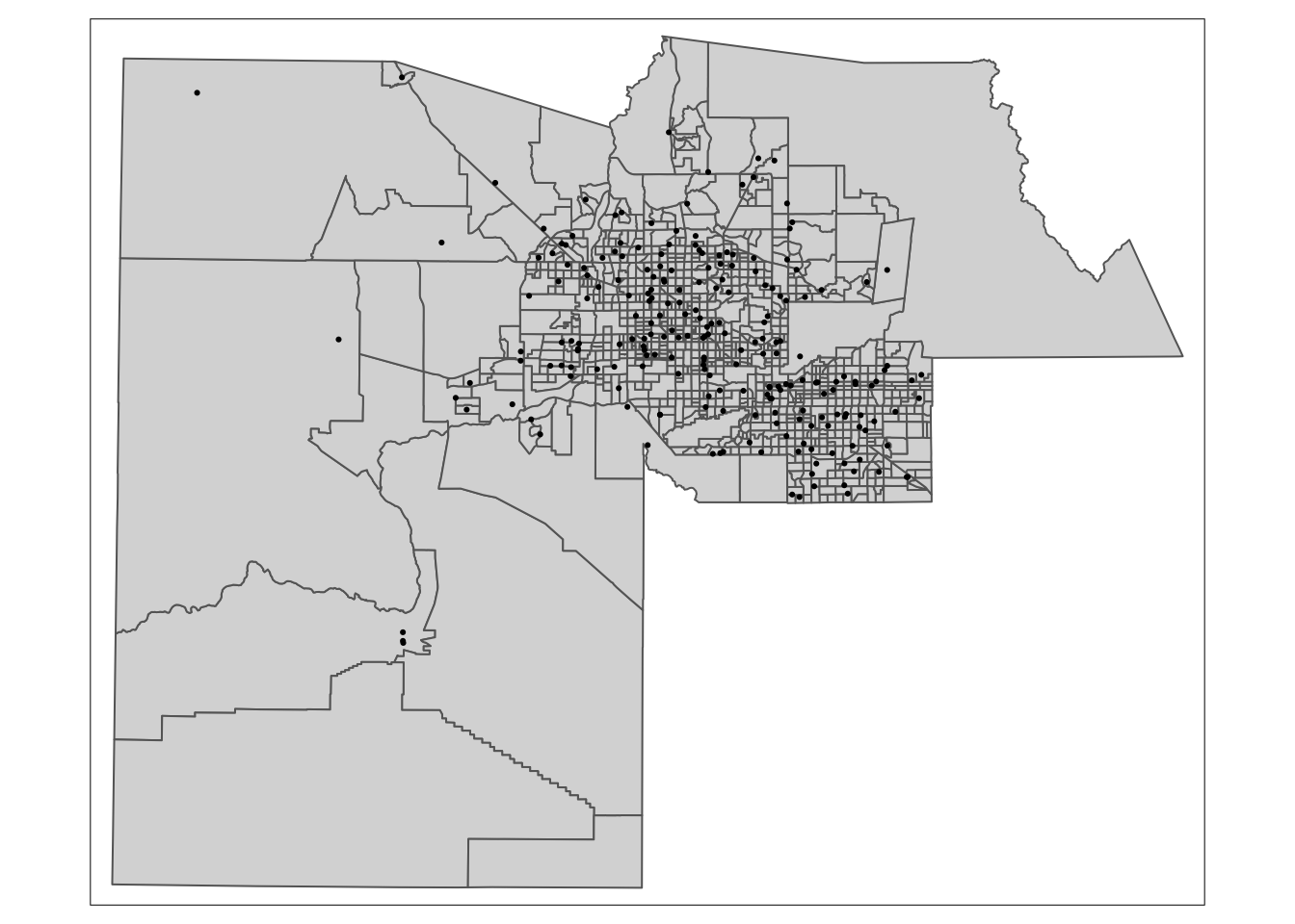
Adding Census data
I downloaded some data from the 2018-2021 American Community Survey. You can load it into your environment using this code chunk:
maricopa_demo <- readRDS(
                       url ("https://cronkitedata.s3.amazonaws.com/rdata/maricopa_tract.Rds")
)
Now, just like any other data, we can join these two datasets.
maricopa_demo_map <-
  maricopa_geo |>
  left_join ( maricopa_demo, join_by ( GEOID==geoid)) |>
  select (GEOID, tot_pop:pct_minority )


glimpse (maricopa_demo_map)
Rows: 1,009
Columns: 6
$ GEOID <chr> "04013422102", "04013422308", "04013103304", "0401342070…
$ tot_pop <dbl> 4558, 5491, 4164, 5022, 3441, 6215, 4353, 3800, 3990, 58…
$ nonhisp_white <dbl> 1523, 3237, 1152, 4123, 2540, 3730, 3983, 2371, 3039, 55…
$ median_inc <dbl> 34486, 93581, 41853, 110208, 96406, 60598, 141107, 65033…
$ pct_minority <dbl> 67, 41, 72, 18, 26, 40, 8, 38, 24, 91, 17, 48, 17, 16, 5…
$ geometry <POLYGON [°]> POLYGON ((-111.8746 33.4049..., POLYGON ((-111.8…(You don’t need to select the “geometry” column – it has to be there if it’s a map.)
33.4 A chloropleth map
Now we can use colors to show the percent of each tract that identified as a racial or ethnic minority in the American Community Surveys.
tm_shape ( maricopa_demo_map,
           projection = 2868) +
  tm_polygons ( col = "pct_minority",
                style = "jenks",
                palette = "YlGnBu",
                border.col = NULL)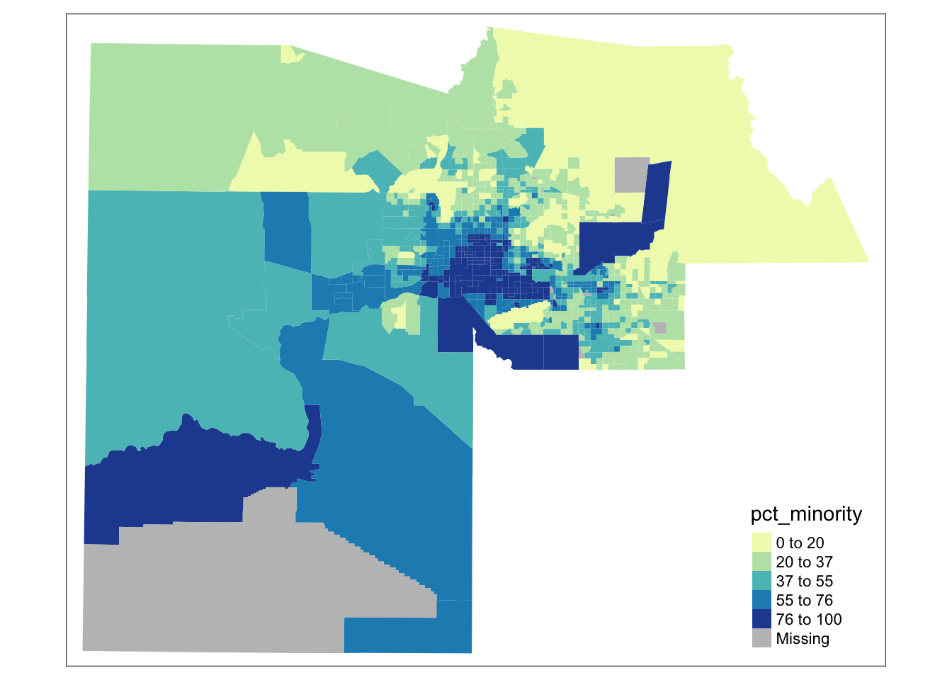
There are a lot of options for drawing the maps, but these are the most common. Using “jenks” natural breaks to find the groupings for colors. It tries to find a place where big changes in color won’t happen for minor differences, but it sometimes needs to be tweaked.
Color palettes
You may notice I changed the color palette so that the states with a lot of water are in blue and those with little are in yellow! Here are the common palettes used in R, which come from the Color Brewer: color advice for cartography:
RColorBrewer::display.brewer.all()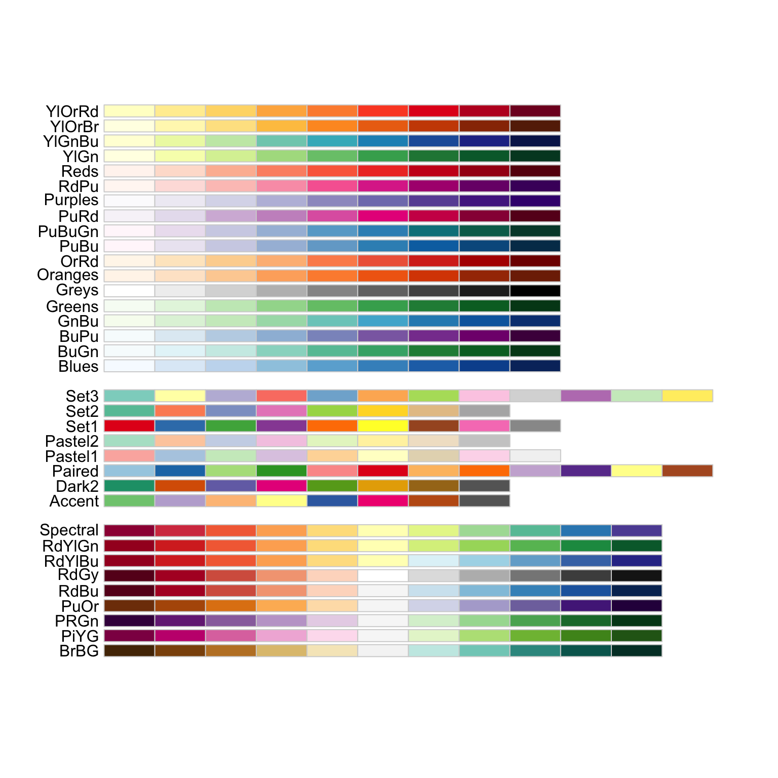
33.5 Adding the voting places and making it interactive
tmap_mode("view")

tm_shape ( maricopa_demo_map,
           projection = 2868) +
  tm_polygons ( col = "pct_minority",
                style = "jenks",
                palette = "YlGnBu",
                border.col = NULL,
                alpha = .3) +
tm_shape ( locations_map) +
  tm_dots (col = "red")
You have now made an interactive map of the Census Tracts and voter locations in Maricopa County, from start to finish! It’s not good enough to publish, but it’s good enough for you to explore on your own.
This method of making maps doesn’t have very many options, but it’s the simplest way to get started.
You can also use the ggplot library, with additional options added with other packages, to create a publishable static or interactive map.