top100 |>
  filter ( performer == "Taylor Swift") |>
arrange ( chart_date ) 16 A quick tour of verbs
In this chapter
You only need a handful of key verbs of the tidyverse to get a lot done:
select: Pick out and arrange columnsarrange: Display rows in a certain ordermutate: Create new columns using functions and formulasfilter: Pick out rows based on a conditionsummarize: Compute summary statistics such as sum, count or mediangroup_by: Collapse your data into categories based on a column, as in pivot tables
You have done all of these in Excel already.
We saw in the first R chapter that the tidyverse is a whole set of packages linked together using common syntax and grammar. One of the key concepts of the tidyverse is its verbs . Mastering just a handful of them will equip you to do most of what a data journalist does, and will prepare you for more complicated endeavors.
This walkthrough gives you a little taste of what most of the verbs do. More details are coming in subsequent chapters.
It depends on you continuing from the previous chapter. You can download a copy of the data that was saved into your project if you need it. ## A new markdown program
Open or re-open the project you created in previous chapters. This starts you with a clean slate in the correct location.
Create a new Quarto document. Using the program you wrote in the last chapter, copy everything in through the setup chunk and delete anything else. Edit the YAML section to create a new title , and save it as
top100-02-analysis.qmd.Re-load the data you saved in the last chapter by adding a code chunk with this function:
top100 <- readRDS("hit100.RDS")
Assuming that’s what you saved it as in the last chapter
16.1 Filter and arrange
filter is the same idea as filtering in Excel, but it’s much more picky. In R, you have to match words exactly, including the upper- or lower-case.
arrange is R’s version of Excel’s sort.
Here’s how you would pick out all of Taylor Swift’s appearances on the Billboard top 100 list, in chronological order.
Caution
In R, a condition is tested in a filter by using two equal signs, not one.
So Taylor Swift has songs on the Billboard Hot 100 list more than 1,000 times since 2008.
Here’s how you’d list only her appearances at the top of the list – No. 1 is the lowest possible value for this_week, indicating the rank , then pick out just a few columns to list in order:
top100 |>
  filter (performer=="Taylor Swift" & this_week == 1) |>
  arrange ( chart_date)  |>
  select ( this_week, song, chart_date, last_week)
Her first No. 1 hit was in 2012, and her most recent was in November 2021.
16.2 Summary statistics in R
Summary statistics are similar to those you saw in pivot tables. They include
n()– instead of “count”sum()mean()– instead of “average”median()min()andmax()
To count the total number of songs in this database, you would use the summary function n(), which is how statisticians think of the concept of “how many?”
In this case, because we’ve done nothing else, it will match the number of rows in the data frame. This code also creates two other summary statistics: The first (earliest) entry in the entire list, and the last one.
Single vs. double “=”
- Use a single equals sign when you are naming a new column
- Use a double equals sign to see if one thing is the same as another
- Don’t ever name the new column the same thing as another column.
top100 |>
  summarize ( number_of_entries = n() ,
              first_entry = min(chart_date),
              last_entry= max(chart_date)
              )
16.3 Grouping with summary statistics (aggregating)
Your questions will often be around the idea of “the most” or “the biggest” something. Like in Excel, you could do this by guessing and filtering one thing after another. Or you could make a list of the items, then count them up all at once.
To get the performer with the most appearances on the list, you combine group_by with summarize to count within each group. We’ll go into this in a lot more detail in future chapters.
top100 |>
  group_by ( performer) |>
  summarize ( times_on_list = n() ) |>
  arrange (desc ( times_on_list ))  |>
  head (10)
(You may notice that the number next to Taylor Swift’s name on this list is the same number of rows that were found during the filter.)
That code chunk:
- Began with the
top100data frame that was loaded earlier from the saved version, and then - Made one row for each performer using
group_by, and then - Counted the number of times each one appeared using
summarizeandn()and named the new columntimes_on_list, and then - Sorted, or
arrangethe list in descending order by that new column created during the summarize step, and then - Printed off the first 10 rows.
In Excel, we had trouble sorting a pivot table with city and state as rows. Here, that’s not a problem:
top100 |>
  group_by ( song, performer)  |>
  summarize ( times_on_list = n() ,
              last_time_on_list = max(chart_date),
              highest_position = min(this_week)
            ) |>
  arrange ( desc ( times_on_list) ) |>
  head(25)
So some of the songs that were on the list the longest never made it to #1. (You’ll learn later on how to make tables that are more easily navigated.)
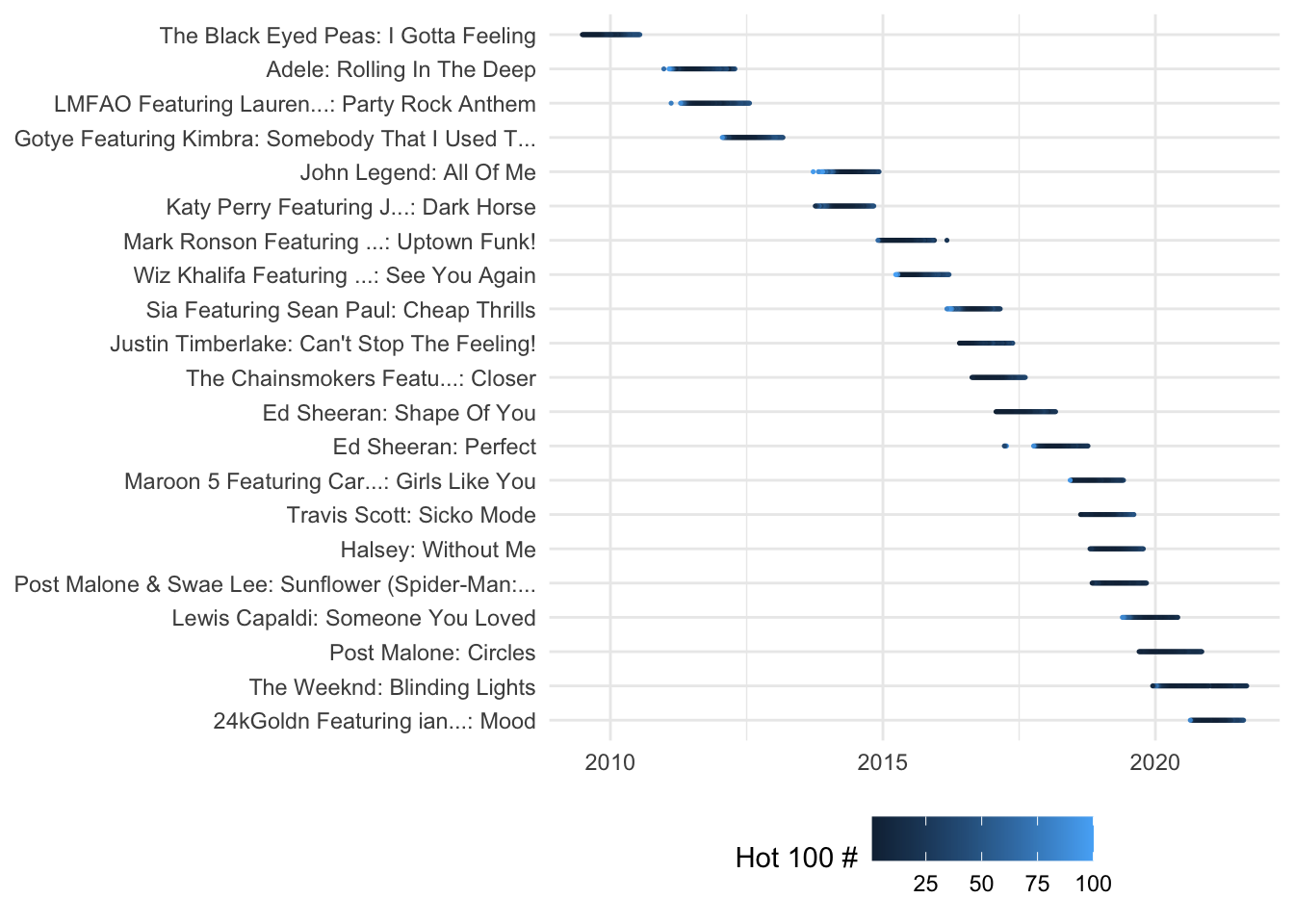
16.4 Make a chart!
One motivator in learning R is its very sophisticated graphics. Here, you can just copy and paste this code to see how it might work, without worrying about exactly what it does. We’ll learn how to make this interactive in a future lesson.
I’ve made a dataset for you that contains the 21 No.1 songs that stayed on the Hot 100 for at least a year in this century. (Songs released after late 2020 will be missing, since the data is a little old and there has to have been at least a year since the release.) You can just copy and paste this code chunk and then render your page, just to prove that — even if you don’t understand it yet — it’s not a lot of work to make a reasonable-looking chart.
```{r}
#| label: hot-100-top-10-list
#| column: screen-inset-right

# read the data
readRDS(
  url ("https://cronkitedata.s3.amazonaws.com/rdata/top_songs.RDS")
  ) |>
# start the plot
  ggplot (
        aes ( x=chart_date, y=hit, color=this_week )
        ) +
       geom_point(  size= .25) +
# make it look a little better
  labs( color = "Hot 100 #") +
  theme_minimal( ) +
  theme(axis.title.x = element_blank(),
          axis.title.y = element_blank(),
#         panel.grid.major=element_blank(),
        legend.position= "bottom")
```
16.5 Thoughts on the verbs
You’ve now seen most of the key verbs of the tidyverse, and how they can be put together. They are:
mutate, which you saw in the last chapter, to create new columns.select, to pick out columns in the order you want to see themfilter, to pick out rows based on a conditionsummarizeto compute summary statistics like “how many?” and “how much? or”smallest” and “largest”group_byto create a single row for each unique item in a list.
Don’t worry if you don’t understand how this works or how to do it yourself. This walkthrough is just intended to show you how much you can do with just a few lines of code.